Every Dish a Canvas: How Serious Home Cooks Are Applying Fine Art Principles to the Plate
There is a moment, familiar to anyone who has stood before a great painting, when the eye stops wandering and simply settles. The composition holds you. Something in the arrangement of color, weight, and space feels not merely pleasing but inevitable — as though no other configuration could have existed. A growing number of serious American home cooks are chasing precisely that sensation, not in a museum, but in their own kitchens, one plate at a time.
This is not the hobbyist impulse to garnish a dish with a sprig of parsley and call it presentation. What is emerging across American dining rooms and culinary circles is something considerably more deliberate: a sustained, studied effort to apply the visual grammar of fine art — composition, color theory, negative space, tension, and release — to the act of plating a meal. The results, at their most accomplished, are genuinely arresting.
The Gallery as Classroom
For practitioners of this approach, the education often begins far from the stove. Caroline Marsh, a Chicago-based architect and self-described obsessive home cook, describes spending an afternoon at the Art Institute before a dinner party she was hosting, studying the color relationships in a Rothko canvas. "I wasn't looking at the painting the way I normally would," she explains. "I was thinking about how those warm ochres sat against the deep burgundy, and whether I could create that same sense of weighted warmth on a plate — maybe a saffron-poached pear against a pool of dark cherry reduction."
This kind of cross-disciplinary literacy is precisely what distinguishes the most intentional practitioners from those who are simply plating attractively. The difference lies in the depth of the visual vocabulary being deployed. When a cook understands why Mondrian's rigid grids feel simultaneously rigid and liberating — the tension between constraint and color — they begin to see how a composed plate of precisely cut vegetables, arranged with deliberate asymmetry, might produce a comparable visual experience for a dinner guest.
Color Theory at the Table
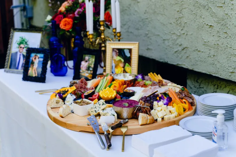
Among the fine art principles that translate most directly to the plate, color theory may be the most immediately actionable. The painter's understanding of complementary colors — the way violet and yellow intensify each other, or how a touch of acid green electrifies a field of deep red — is as applicable to food as it is to pigment.
Consider the visual logic of a beet carpaccio: deep magenta rounds, offset by the pale gold of a shaved fennel, finished with the creamy white of a sheep's milk cheese. Each element earns its place not only for flavor but for the chromatic conversation it enters. The cook who has studied color relationships — who knows, for instance, that Basquiat's raw, high-contrast palettes generate urgency through deliberate chromatic collision — will approach that plate with a different ambition than one who is simply arranging ingredients.
The practical lesson is this: before you plate, consider the dominant hue of your dish and ask what color would create the most compelling contrast or harmony. A roasted carrot bisque, for example, occupies a narrow warm register; a scattering of deep purple microgreens or a swirl of cool crème fraîche introduces the visual tension that transforms a bowl of soup into something worth pausing over.
Negative Space and the Courage to Leave the Plate Empty
Perhaps the most challenging principle for the home cook to internalize is the value of restraint — the fine art concept of negative space, the deliberate emptiness that gives a composition room to breathe and directs the eye toward what matters most.
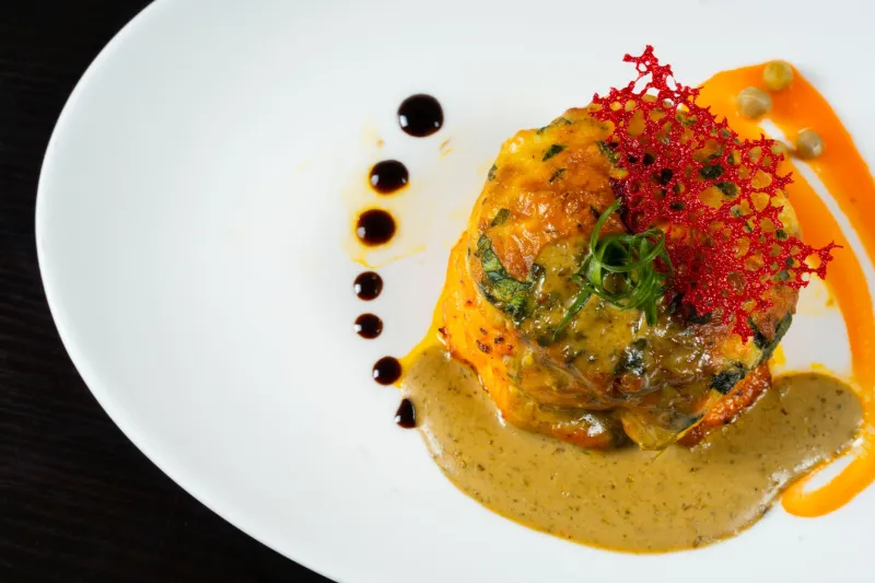
In painting, negative space is not absence but presence. The pale ground around a Morandi bottle is as compositionally active as the bottle itself. Applied to plating, this principle argues against the instinct to fill: a single elegant quenelle of mousse, placed off-center on a wide, pristine plate, communicates sophistication in a way that a crowded arrangement never can. The empty space becomes part of the dish.
David Kwan, a San Francisco-based food stylist who began his career in graphic design, describes the shift in thinking this way: "Most home cooks are afraid of the white space. They think an empty plate looks unfinished. But that emptiness is doing work — it's framing the food, creating focus, giving the eye a place to rest before it moves to the next element."
Borrowing from the Masters
For those seeking a more structured framework, the history of modern art offers a remarkably useful set of templates.
Rothko's Color Fields suggest the power of large, soft-edged zones of color — a wide brushstroke of vibrant sauce beneath a protein, its edges allowed to feather naturally rather than being confined to a precise circle. The effect is painterly, atmospheric, emotionally resonant.
Mondrian's Geometric Grids inspire a very different approach: precise, rectilinear arrangements of ingredients that impose order and clarity. A composed salad of heirloom tomatoes, each variety occupying its own defined quadrant of the plate, owes something to Mondrian's conviction that beauty lives in structure.
Basquiat's Raw Energy points toward asymmetry, layering, and deliberate imperfection — a smear of sauce applied with a spoon rather than a squeeze bottle, ingredients tumbled with apparent spontaneity that is, in fact, carefully considered. This approach suits the cook who finds rigid formality constraining and wants the plate to feel alive.
Building Your Visual Practice
The development of a genuine visual sensibility at the table is, like any artistic practice, cumulative. A few disciplines, observed consistently, will accelerate the process considerably.
First, photograph your plates — not for social media, but as a record of your own compositional decisions. Review them with the same critical eye you would bring to a sketch. What is the eye drawn to first? Is there a clear focal point? Does anything feel crowded or unresolved?
Second, visit galleries and museums with the specific intention of studying composition rather than subject matter. Ask yourself how a given painting organizes the viewer's attention, and whether that organizational logic could be translated to a plate.
Third, invest in your vessels. The plate is the canvas, and its shape, color, and scale fundamentally condition what is possible upon it. A wide, shallow, matte-white plate invites an entirely different visual register than a deep, dark stoneware bowl. Serious collectors of art understand that framing and context are never incidental; the same principle applies here.
The Table as Living Gallery
What ultimately distinguishes this movement is its seriousness of purpose. The home cooks who are drawing on fine art principles to inform their plating are not performing for an audience — or not only. They are engaged in a genuine creative practice, one that happens to be edible and ephemeral, consumed in the company of people they care about.
There is something quietly radical in that proposition: that the dinner table can be a site of original visual art, that a plate set before a guest can carry the same considered intention as a work hung on a gallery wall. At Savery Gallery, we have always believed that the appetite for beauty is not confined to any single medium. The most discerning among us find it wherever they have the courage to look — and, increasingly, wherever they have the skill to create it.