The Label as Portrait: What Wine Packaging Reveals About the Hand Behind the Bottle
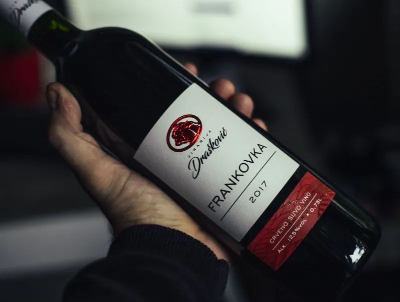
Long before the cork is pulled, a wine label speaks volumes about the producer who commissioned it. For collectors with a trained eye, the typography, illustration, and compositional choices on a wine label function as a kind of visual manifesto — one worth decoding with the same rigor applied to any work on paper. The serious collector of wine is, in many respects, also a student of graphic design, printmaking, and the quiet language of aesthetic intention.
This is not a trivial observation. The finest wine regions in the world — from Napa Valley to the Willamette Valley, from the Finger Lakes to the Santa Ynez — have long understood that a label is the first handshake between producer and collector. How a winery chooses to present itself visually is rarely accidental. It is, more often than not, a deliberate expression of philosophy.
Typography as Temperament
Begin with the letterforms. A label set entirely in a classical serif typeface — think Garamond or Caslon, with their measured strokes and historical weight — signals a producer who aligns with tradition, who wishes to invoke the long lineage of European viticulture and the gravitas of age. These are wineries that take their place in history seriously.
Contrast that with a label rendered in a clean, geometric sans-serif, or in a hand-lettered script that suggests the warmth of a working studio. The former often indicates a modern, terroir-focused producer who prizes clarity and precision over ceremony. The latter tends to signal a smaller, artisan operation — one where the winemaker's personal touch extends from the vineyard all the way to the design table.
Pay attention, too, to the hierarchy of information. Does the producer's name dominate the label, or does the vineyard designation take precedence? A label that foregrounds the appellation or the specific block from which the grapes were harvested is making an argument: that place matters more than personality, that the land is the author of the wine. This is a meaningful philosophical distinction, and it shapes everything from farming practices to cellar technique.
Illustration, Imagery, and the Art of Restraint
The imagery a winery selects — or conspicuously declines to use — is equally instructive. Consider the illustrated labels that have become something of a collecting genre in their own right. Wineries such as California's Bonny Doon Vineyard built an entire brand identity around elaborate, surrealist label art, commissioning original illustrations that invited the collector to linger before ever lifting the bottle. These labels function as limited-edition prints, and many collectors preserve them accordingly.
At the opposite end of the spectrum sits the school of radical restraint: a single color field, an embossed crest, or nothing more than a few lines of text on uncoated paper. This minimalism is its own statement. It communicates confidence — the conviction that the wine requires no embellishment, that the liquid inside is the only argument worth making. Collectors who respond to this aesthetic tend to prize the same qualities in the art they hang: works that trust the viewer to meet them halfway.
Between these poles lies a rich middle territory of botanical illustration, topographic maps, architectural renderings, and abstracted landscapes — each a different mode of telling the story of a place. When a Virginia winery commissions a detailed engraving of the Blue Ridge foothills for its label, it is doing something quite deliberate: anchoring its wine in a geography, insisting that this particular corner of the American continent is worth your attention.
Color, Paper, and the Tactile Dimension
The sophisticated collector does not stop at imagery. The substrate — the paper itself — carries meaning. A heavy, uncoated stock with visible texture suggests a commitment to craft over commerce; it is the label equivalent of a hand-thrown ceramic versus a factory-pressed plate. Foil stamping, debossing, and letterpress printing all communicate investment, both financial and aesthetic. They are the producer saying: this object deserves to be touched.
Color choices operate on a similarly coded register. Deep burgundy and gold speak to tradition and luxury. Muted earth tones — ochres, sages, the warm grays of aged stone — suggest a producer oriented toward the natural wine movement or organic farming. Bright, unexpected color combinations often signal a younger winery unafraid of irreverence, one whose winemaker came of age looking at contemporary art rather than European auction catalogs.
Building a Label Collection
For those who wish to engage with wine labels as collectible objects in their own right, the practice requires little more than intention and a clean razor blade. Soaking a finished bottle in warm water releases most labels intact; others may be peeled cleanly if the adhesive is of sufficient quality — itself a subtle indicator of a producer's attention to detail.
Many serious collectors maintain archival sleeves of labels organized by region, producer, or vintage year — a practice that mirrors the maintenance of a print portfolio. Others frame particularly distinguished examples, treating them as the works on paper they functionally are. The label from a celebrated single-vineyard Pinot Noir, illustrated by a known artist and printed in a limited run, may appreciate in cultural value over time in ways that parallel the work of emerging artists in other media.
The Label as Curatorial Statement
Ultimately, reading wine labels with the same intentionality one brings to a gallery wall is an exercise in understanding how aesthetic choices accumulate into a point of view. A cellar built around producers who share a commitment to visual restraint, typographic precision, and regional specificity is a cellar that reflects the collector's own sensibility as clearly as any wall of paintings.
The most discerning American collectors have always understood that connoisseurship is not confined to any single medium. It is a habit of attention — a willingness to ask, in every encounter with a made object, what the maker believed and how those beliefs shaped every decision. Wine labels, at their finest, offer precisely this invitation.
Lift the bottle. Look carefully. The conversation has already begun.